HAUS is an application designed for those who are interested in investing in properties but want to do so with ease. Instead of spending hours doing searches through multiple real estate sites, it brings those properties right to the user.

Design Objectives
Ease of Use
Make the application easy to find investment properties by either using a phone, tablet or desktop computer.
Appealing
Help make the process fun for finding properties within the user's criteria. Give them options for saving favorites, contacting the property owners or agents, mapping to a location and get recommended picks.
Simple Design
Display the most needed items for searching for a property. Use of pleasing colors, fonts, imagery and icons.
User Journey Workflow
Thinking about the initial workflow of how the user was going to interact with this application, I created a workflow to help me understand the UX of which actions and flows were needed for the app to make function fully.
Low-Fidelity Mobile Wireframes
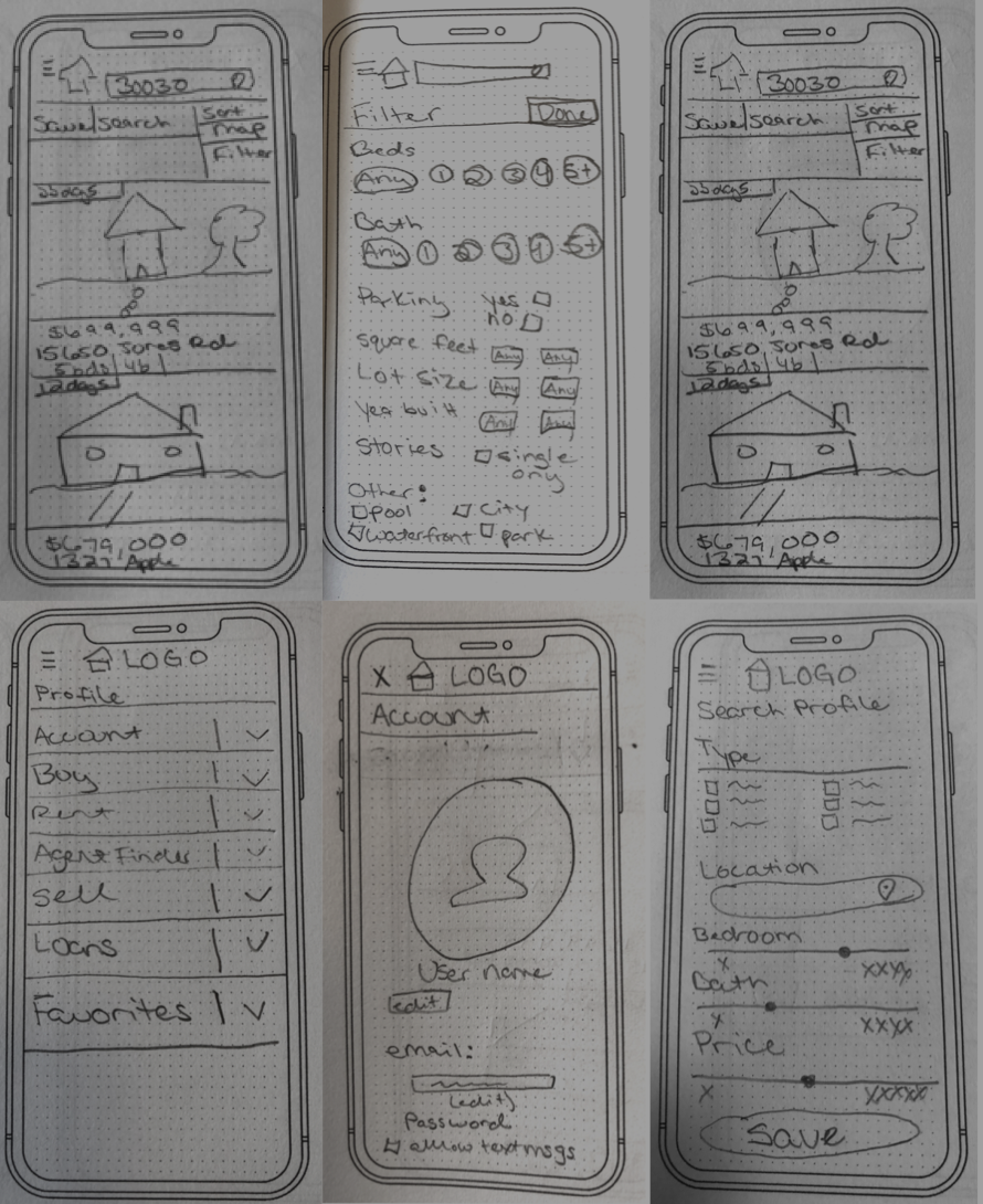
The starting point of taking the research from the user flow was to put that into a mobile app flow. I took some time to think about how the user was going to interact with the screens with an initial sketch of what it would look and feel like.
Mid-Fidelity Mobile Wireframes
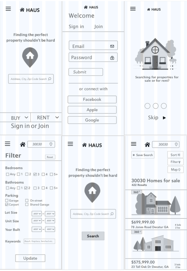
After putting the sketches in InVision and testing the designs, it was time to convert the sketches into mid-fidelity wireframes. After creating mid-fidelity screens, the designs were retested using InVision.
Moodboard.
Dream it.
This board is inspired by the fresh blue found in nature. Incorporating blues, greens, reds
and white as supporting colors, it evokes brightness. It is calm, trustworthy, and serene. The typefaces are simple, easy to read and friendly.
High Fidelity Mobile Prototypes
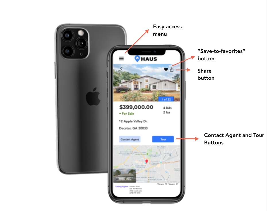
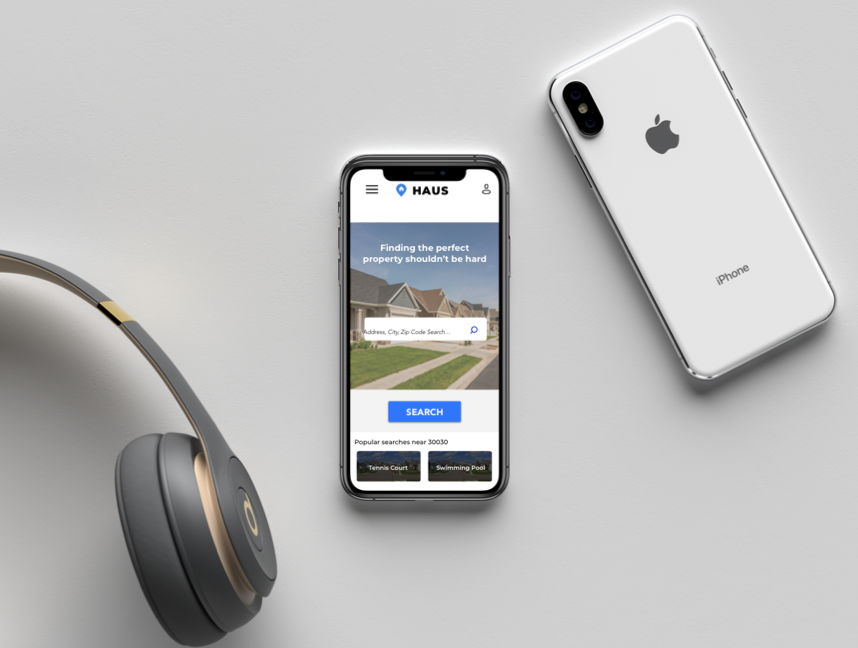
Once I had the colors figured out, I applied them to the mid-fidelity design using Sketch. At this point, I started to add imagery that matched well with the color palettes being used.

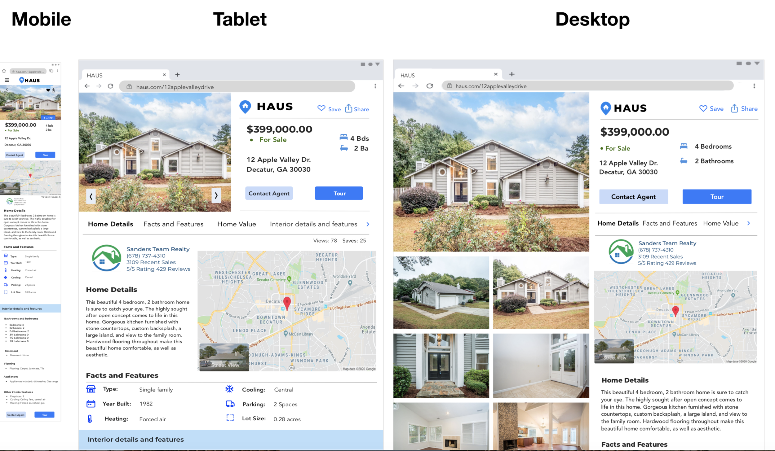
Responsive Design-Desktop and Tablet
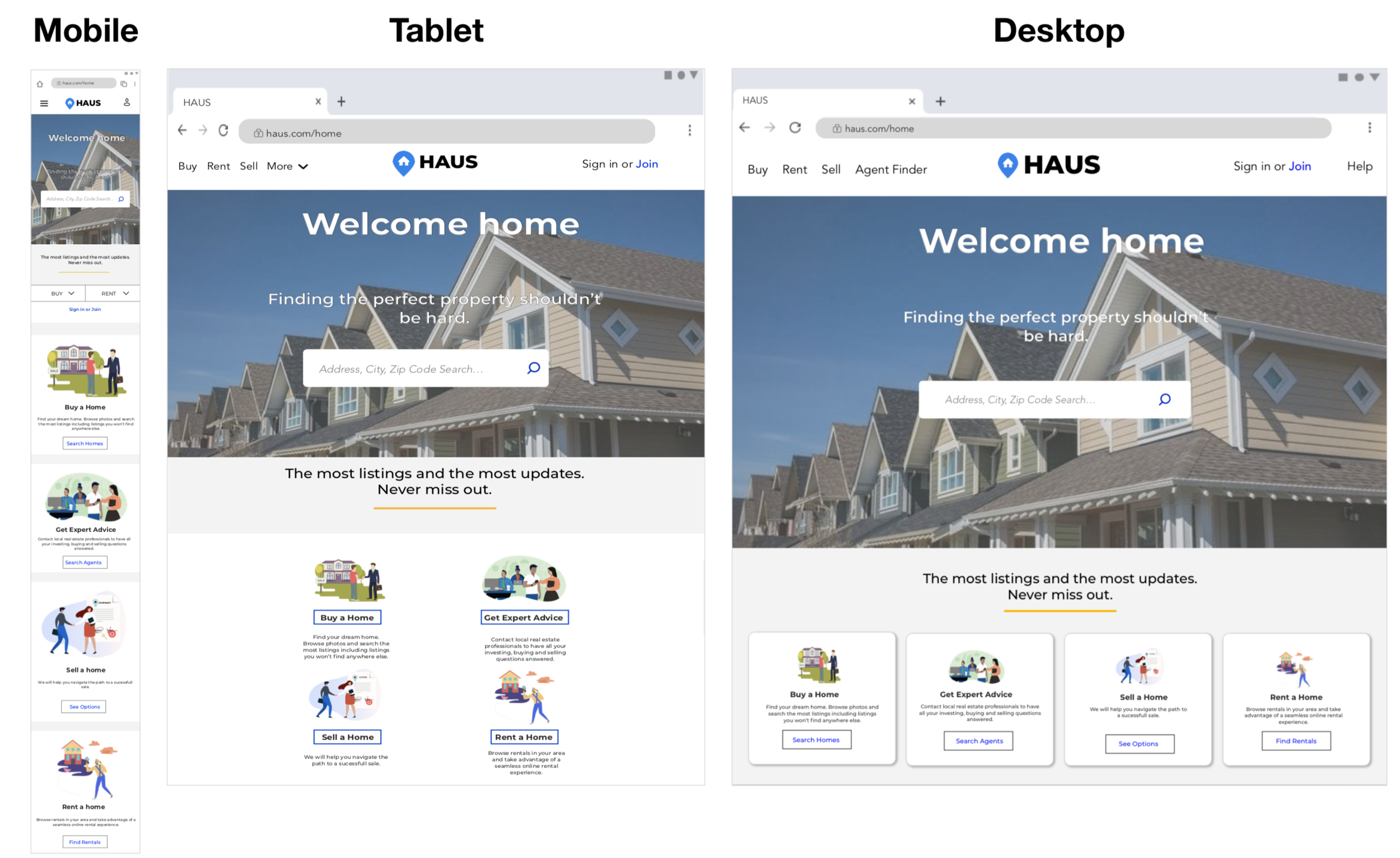
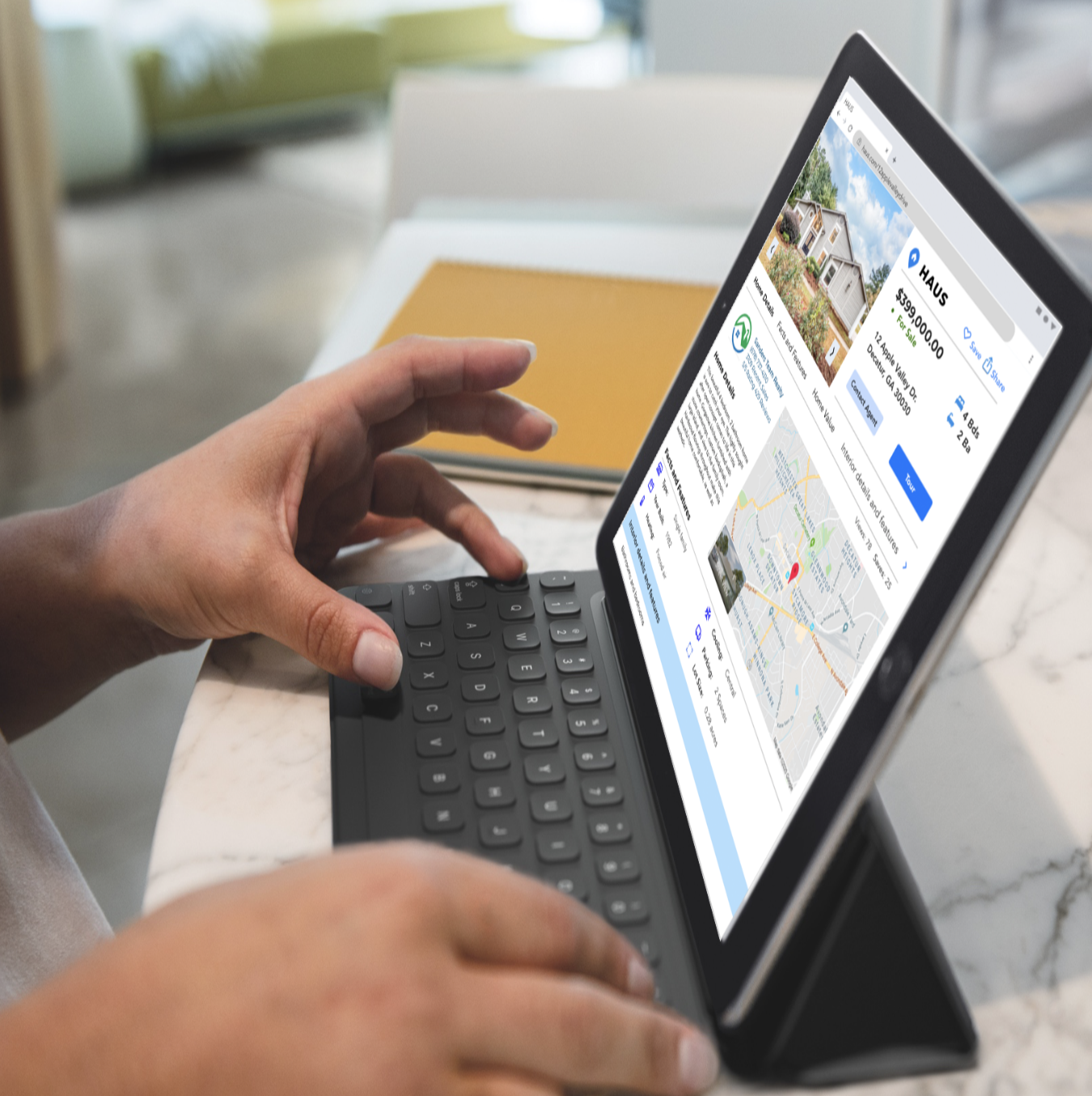
After the high fidelity mobile screens were created, different breakpoints were considered for tablet and desktop devices.


